Further analysis of simulation data for the Population-consumption model demonstrates how humanity has historically sought out the most options for living with more people than we have.
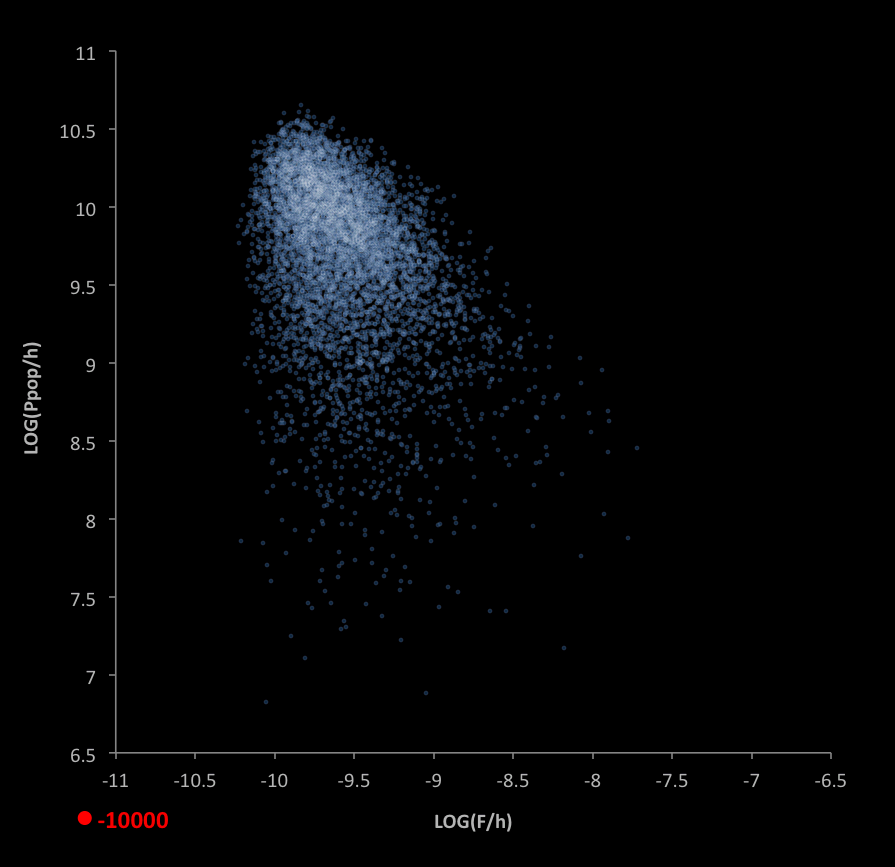
A simulation of 7,150 "habitable worlds" (options matching the criteria on p.1) show a cloud-like distribution when plotted as shown below. In the graph,
- The red dot represents historical values, with the year displayed at the bottom (for years beginning at 10000 B.C.)
- Blue dots are habitable worlds that have populations less than the historical value, and environments limited by the historical maximum environments
- Blue-white dots are habitable worlds with populations at least as large as the historical value
- Ppop is the world population (people)
- h is happiness (fraction)
- F is ecological footprint (Earths/person/year)
- Historical data is shown beginning in the year 10000 B.C. and ending in the year displayed in the legend
- LOG is the base-10 logarithm of the expression in perentheses
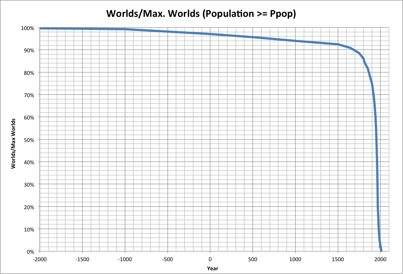
Unique to our historic trajectory is the decrease in available worlds over time. The following graph shows this, where the worlds are limited to those with:
- Populations greater than or equal to the historical values
- Maximum environments less than or equal to the historical maximum environments
Roll over the graph to see a close-up.
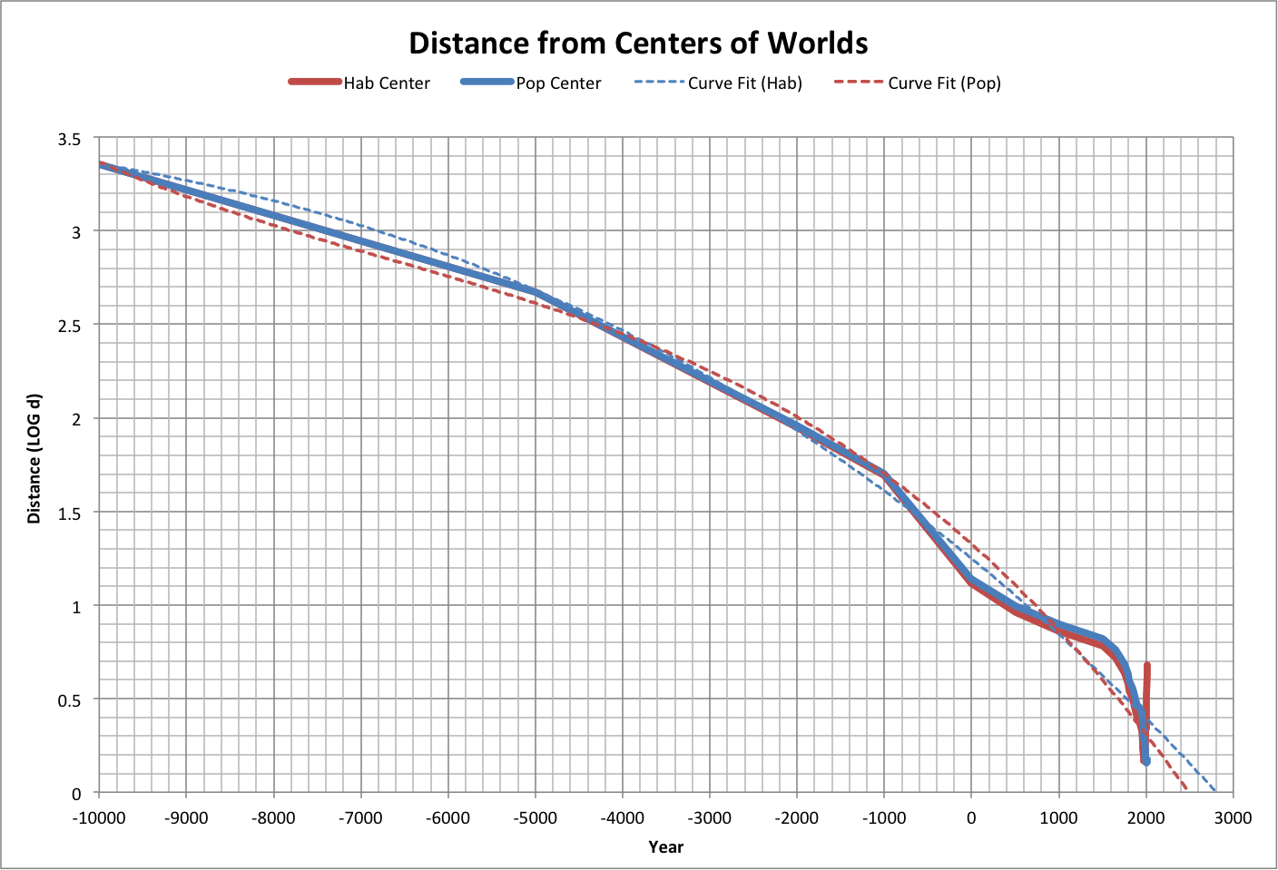
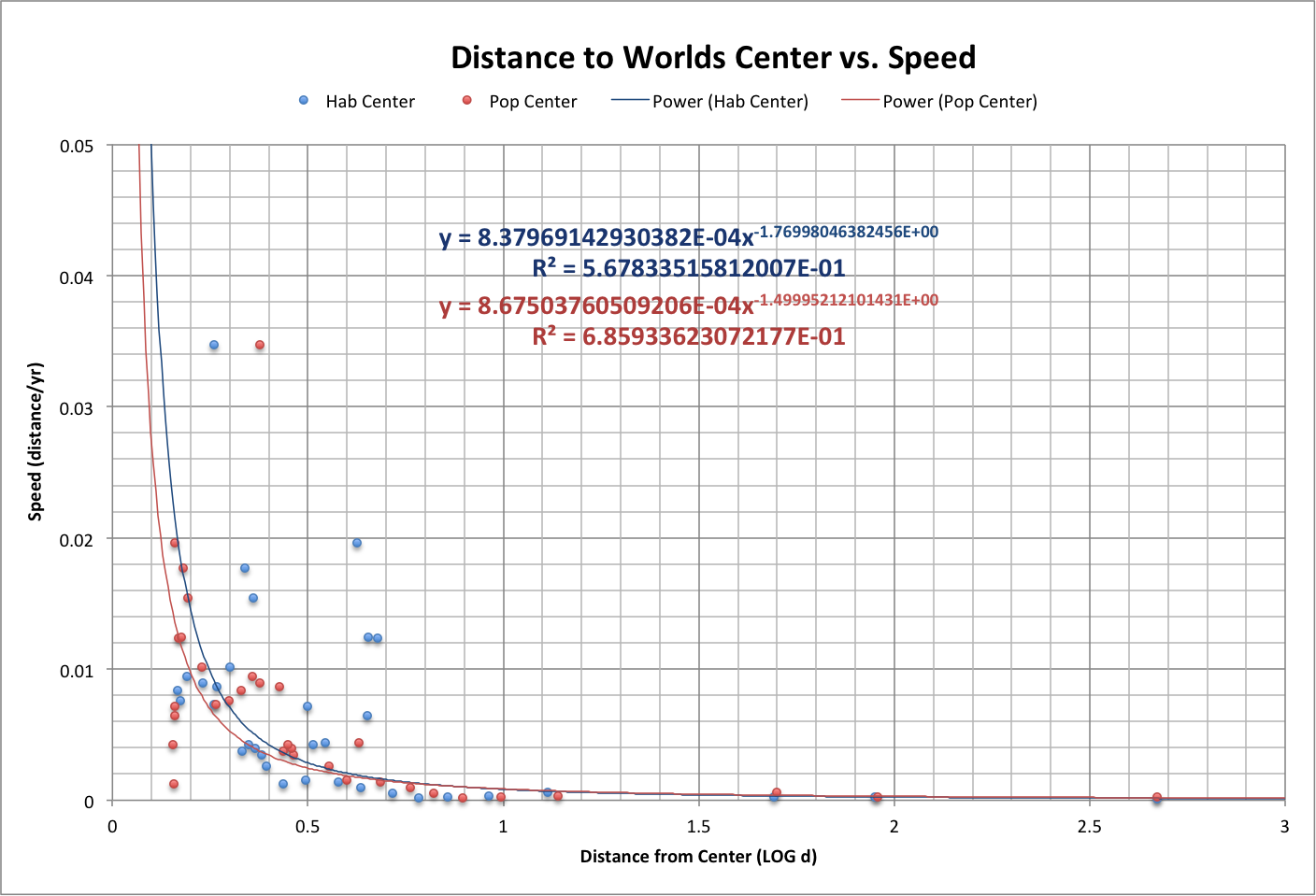
The following graph shows how the distances to both the center of habitable worlds ("Hab Center") and the center of habitable worlds with populations greater than ours ("Pop Center") as calculated using the simulation. The positions of Hab Center and Pop Center change because worlds not meeting their respective criteria become impossible and disappear.
Note that the projected year that we might reach the Hab Center (using a third-order polynomial curve fit) matches when the Best case projection approaches the maximum population and happiness.
Roll over the graph to see a close-up. It shows that we appear to have gotten as close as we can to the Pop Center.
The speed that we move varies with how close we are to the centers, as shown below, along with curve fits suggesting that there is a defining relationship between distance and speed.
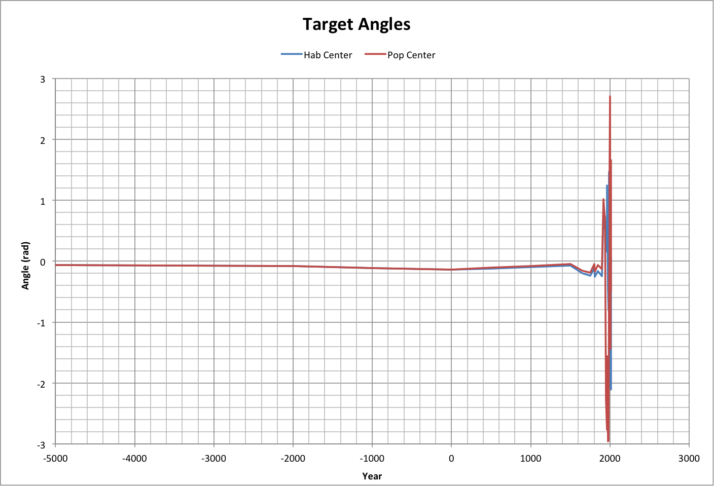
To test whether we are actually aiming at the centers of worlds, the following graph shows the difference in viewed angles between the path being taken and the two centers of worlds as they were seen at the beginning of the path. In other words, the order of events is thus:
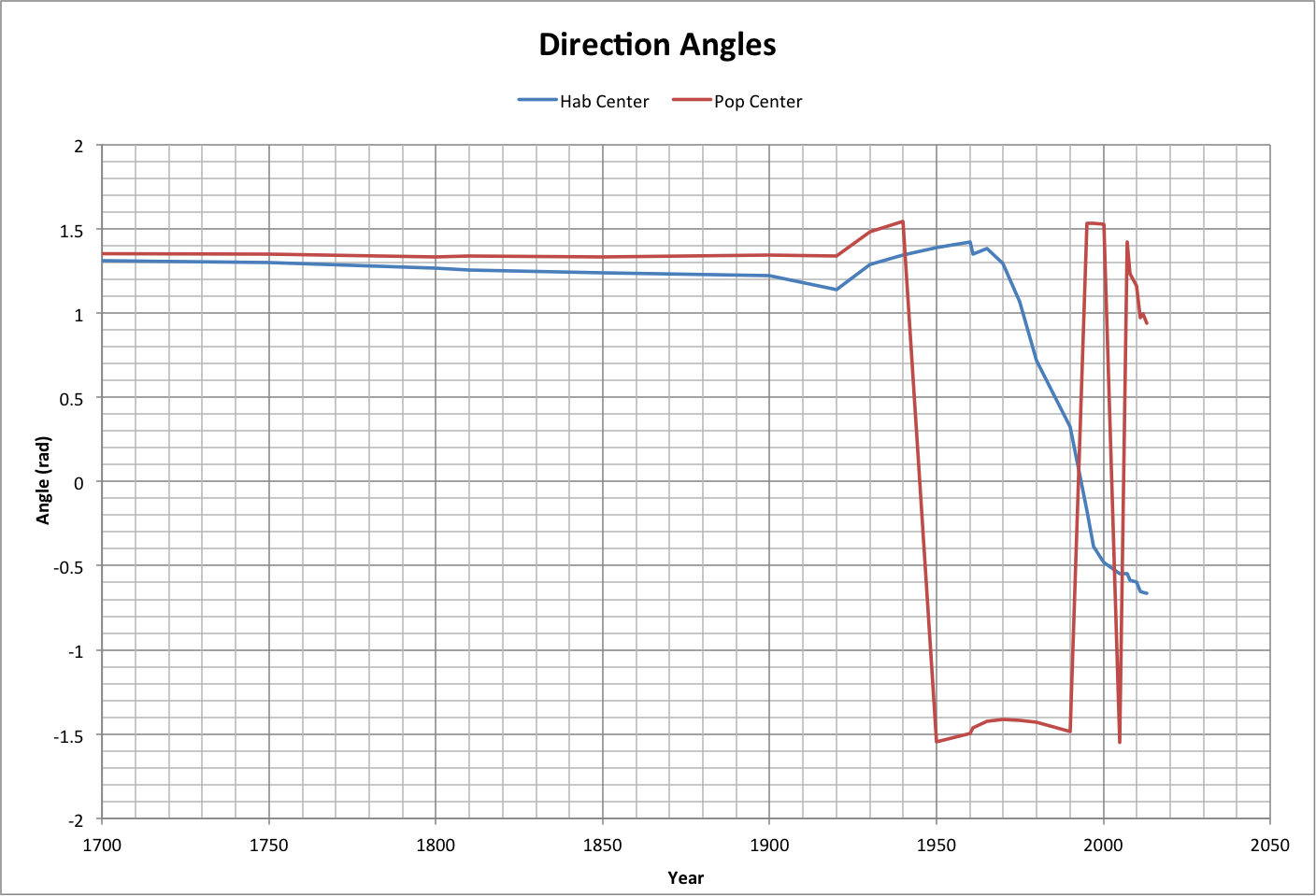
- At any given year, locate the Hab Center and the Pop Center (direction angles Ahab and Apop) using LOG(F/h) for x and LOG(Ppop/h) for y.
- Head in a particular direction (path angle Apath).
- Calculate the target angles (Hab Center Target Angle = Ahab - Apath, Pop Center Target Angle = Apop - Apath).
We are correctly aiming at a center of worlds if the target angle is 0. Roll over the graph to see a close-up.
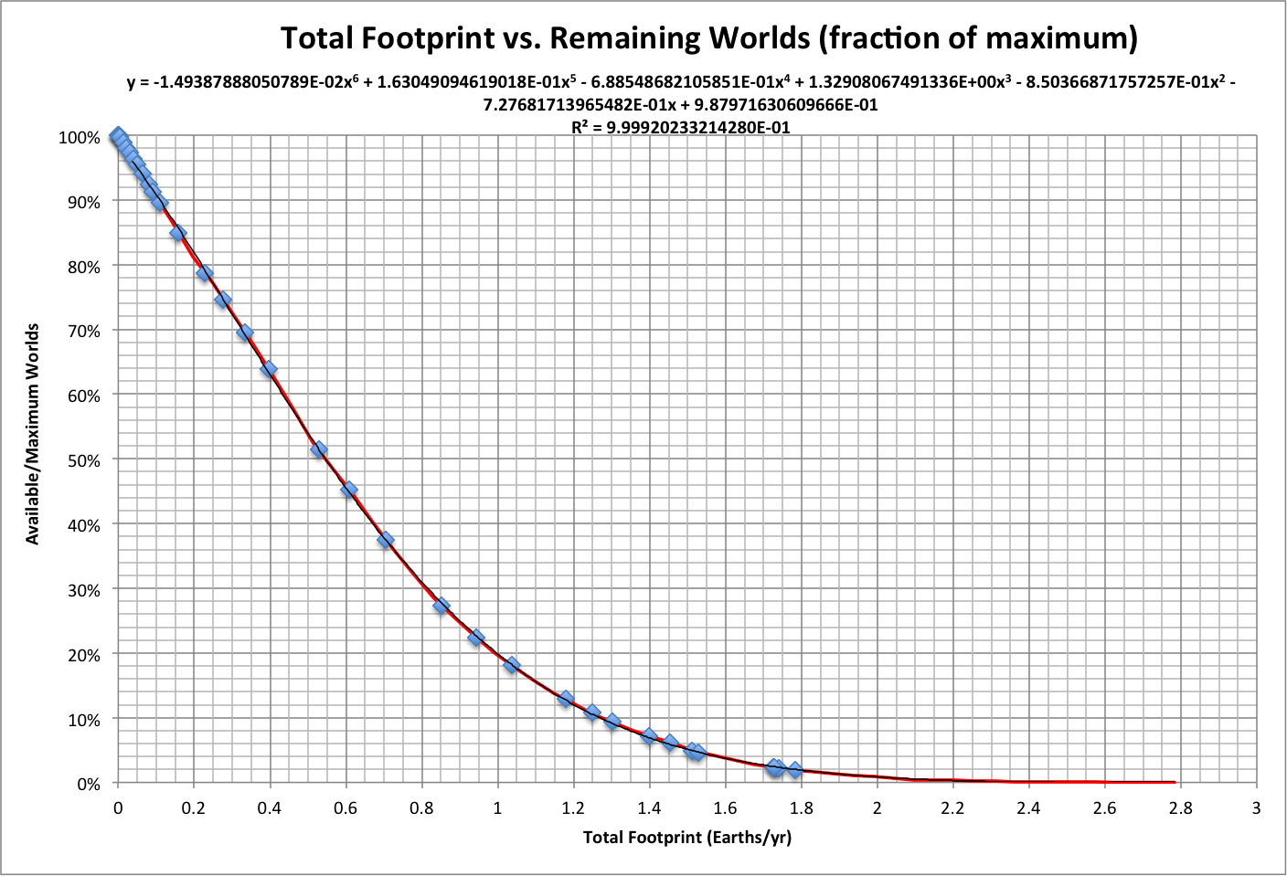
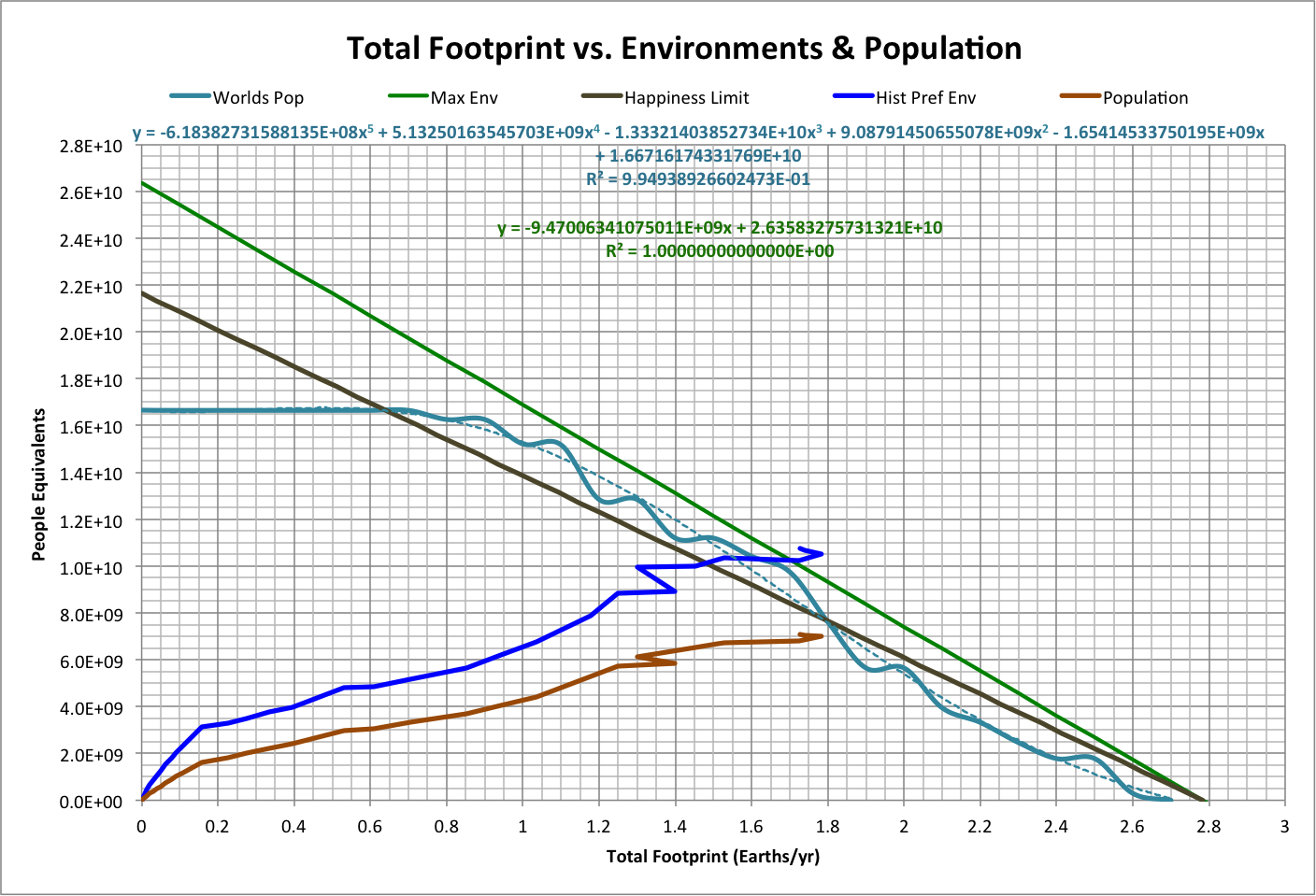
The following graph summarizes other basic elements of the model, using total footprint as the determining variable:
- Worlds Pop is population of the remaining world in the simulation with the largest population (independent of Ppop)
- Max Env is the maximum number of environments available, which is proportional to the populations of other species (Living Planet Index)
- Happiness Limit is the number of environments that can be occupied where the ratio of population to maximum environments equals maximum happiness (0.82)
- Hist Pref Env is the preferred number of environments over history (population divided by happiness, Ppop/h)
- Population is the historical population (Ppop), in people
Note that the putative population peak occurs close to where Worlds Pop intersects Happiness Limit.
Roll over the image to see a projection of population beyond 2013: it approaches the limit, moves away, and approaches again, in an infinite set of oscillations ("popscillation"). This projection is based on a simulation starting in 2013, where the Pop Center is targeted and the speed follows the curve fit of speed to distance from the Hab Center.
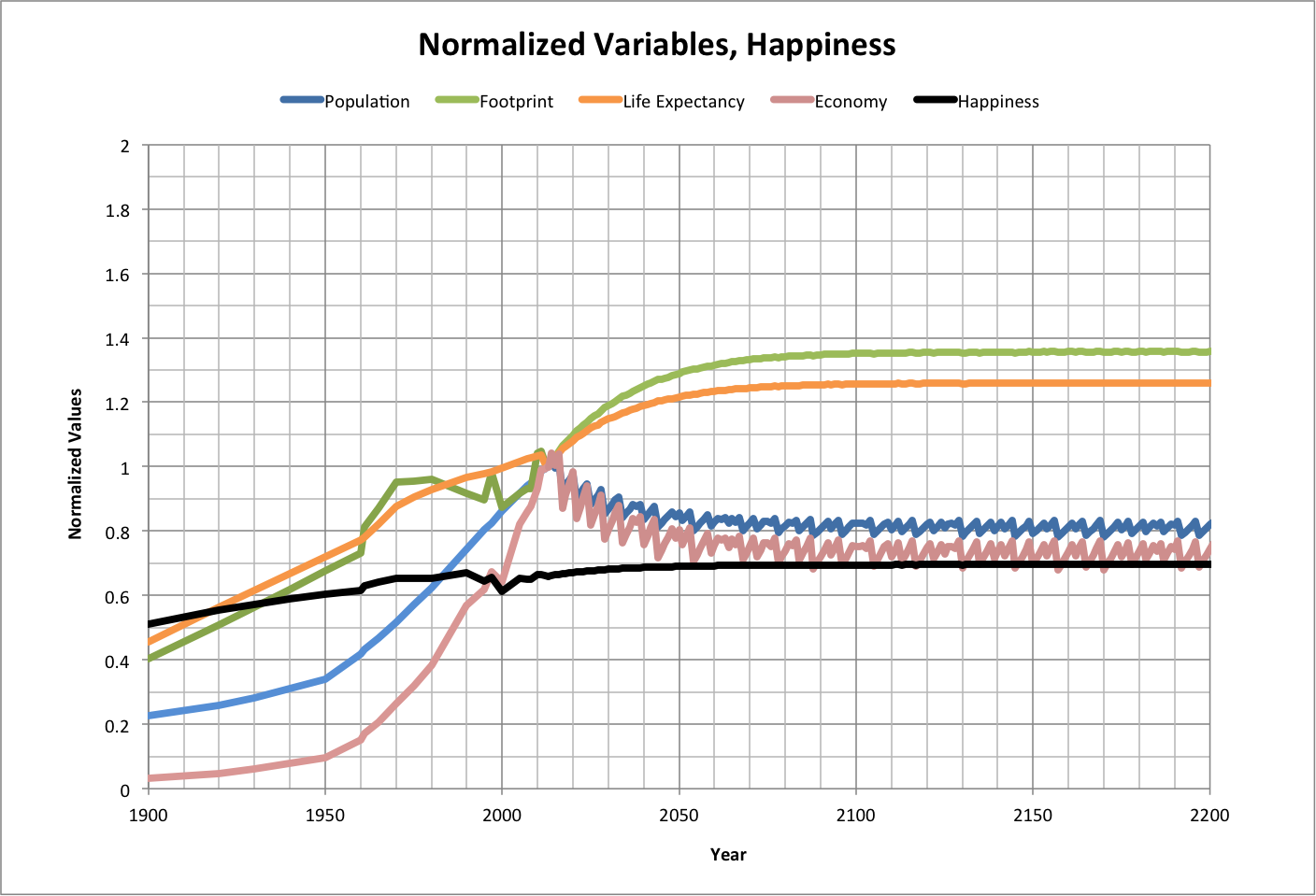
History and projections of variables from 2013 are shown below. The graph shows values of population, footprint, life expectancy, and economy (square of happy environments) that are normalized to what they were in 2013. Actual values of happiness are also shown.
Roll over the image to see a close-up of LOG(F/h) vs. LOG(Ppop/h).
Related pages:
Population-Consumption v4 Main Page
Popscillation (blog post)