Phases (Timelines Version 5)
NOTE: Terms in italics are defined in Timelines Version 5.
The following graphs project how the world poplulation is distributed across phases over time for simulation Green. Each pair of lines surrounds 10% of the population. Minimum phase is in blue, maximum phase is in red, and the phase of mid-population (50%) is in green.
_-1000-2000.png)
_2000-2035.png)
Corresponding epochs are listed in the following table. An epoch starts when people start experiencing the associated phase (Max Phase is at the beginning of that phase), and it ends when people stop experiencing the associated phase (Min Phase is at the beginning of the next phase). In typical usage of the term, the current epoch is the most recent epoch.
| Phase | Epoch | Interval |
| 1 | Colonization | Prehistory to 2025 (A.D.) |
| 2 | Development | 297 - 2026 |
| 3 | Adaptation | 1842-2026 |
| 4 | Climax | 1949-2028 |
| 5 | Exploitation | 1971-2029 |
| 6 | Decline | 2001-2029 |
| 7 | Termination | 2014-2031 |
| 8 | Extinction | 2024-2031 |
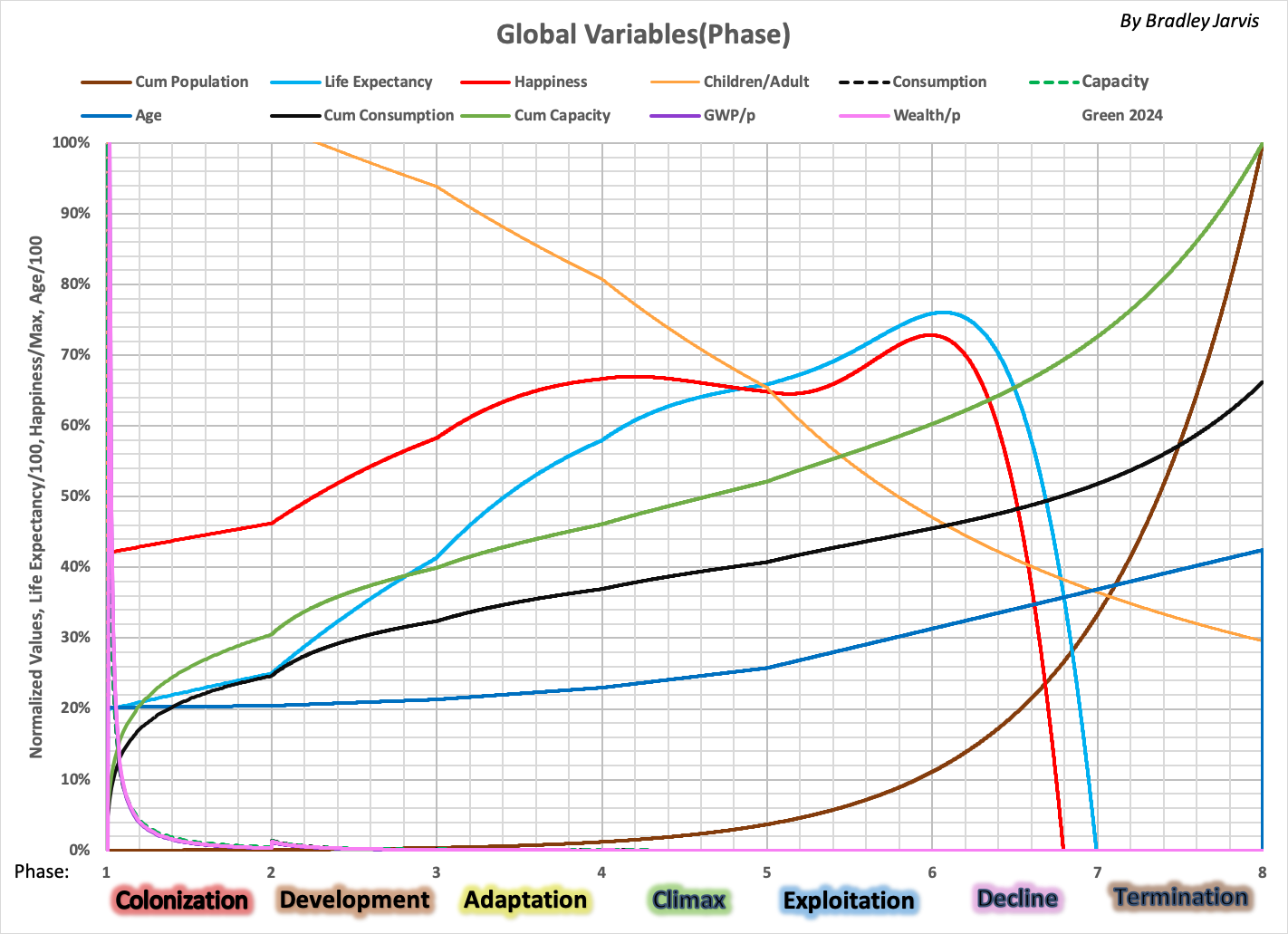
The following graph shows how global variables are distributed over phases as people start to die in 2024 just after peak population.
_2010-2030.png)
_2020-2030.gif)
See also:
- Timelines Version 5 (includes definitions)
- C-low Simulation