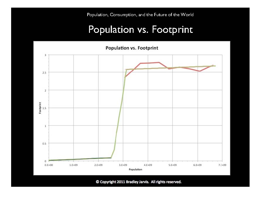
Here we see the result of using lifespan to estimate the historical footprint as a function of population. Interestingly, the slope of the curve up to the 1950 values (just before the sharp increase at the bottom) is the same as the slope after the increase (beginning in 1961).
I can only guess what was responsible for the change in the 1950s; improved agriculture, use of antibiotics, and the birth of the consumer culture are my current favorites. Of course, it could just be an artifact of the data.
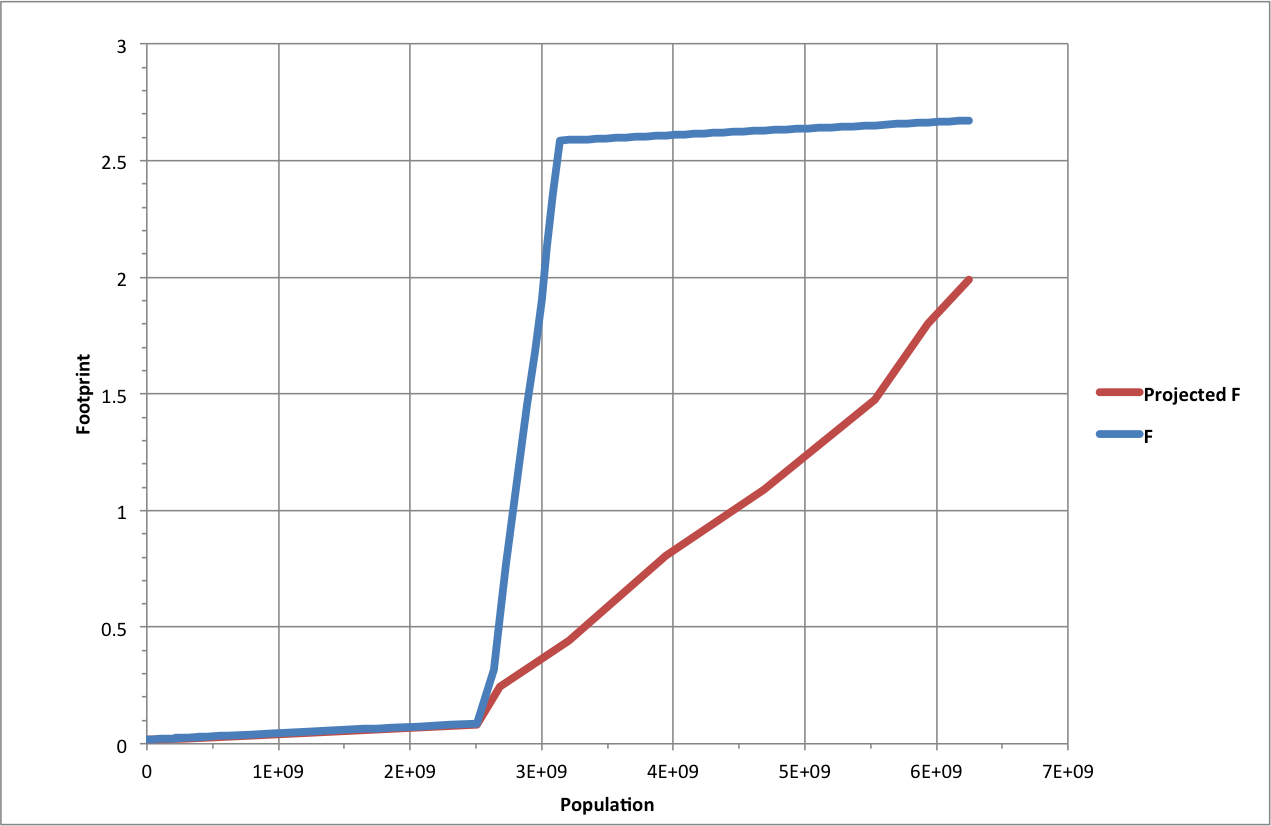
UPDATE: If footprint is calculated from estimates of life expectancy after 1950 (see orange line below), it increases much more gradually. There is still, however, a marked change beginning in 1950 that bears further investigation. Taking into account that the life expectancy of the United States in the 1960s was very close to what it is today, one explanation for the difference may be that "developed" countries were responsible for the vast majority of ecological impact (which seems a truism), making the average much less representative of the whole.
© Copyright 2011 Bradley Jarvis. All rights reserved.