|
Wellbeing What, if any correlation is there between a person's ecological footprint and their wellbeing? The following graphs provide some clues, based on present conditions. Health
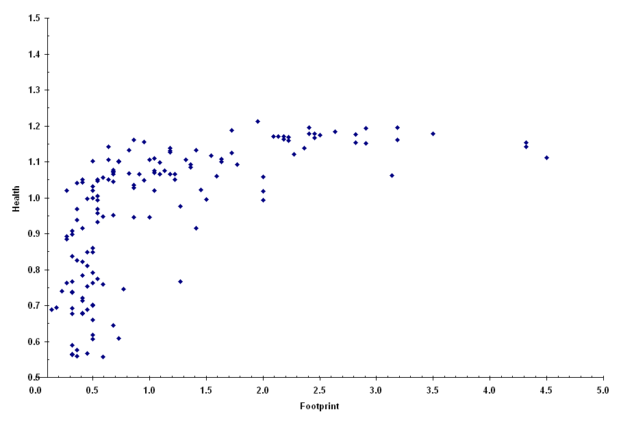
Here, each country whose global ecological footprint we know is plotted as a point on a graph, where Footprint is a country's global ecological footprint (per person) as a fraction of the world average, and Health is a country's average life expectancy (male and female) as a fraction of the world average. Note that, despite the scatter (variation in value for any given footprint), there seems to be no gain in health for footprints higher than two. Wealth
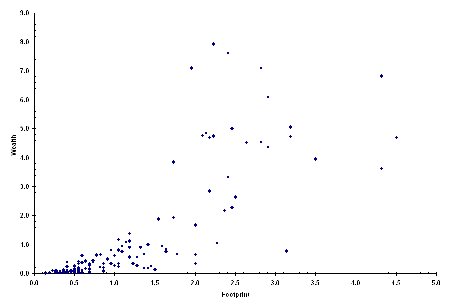
Again, each point represents a country, but here we are plotting wealth as a function of footprint. Wealth is represented by the Gross National Product (GNP) per capita as a fraction of the world average. Notice that the amount of scatter increases dramatically for higher values of footprint. Wellbeing
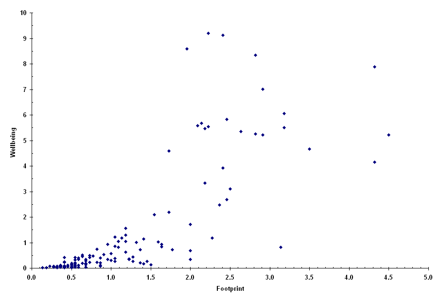
If we multiply health by wealth to represent "wellbeing," the result is shown above. Clearly wealth is dominating health, based on the previous graphs. Following is another way to summarize the information:
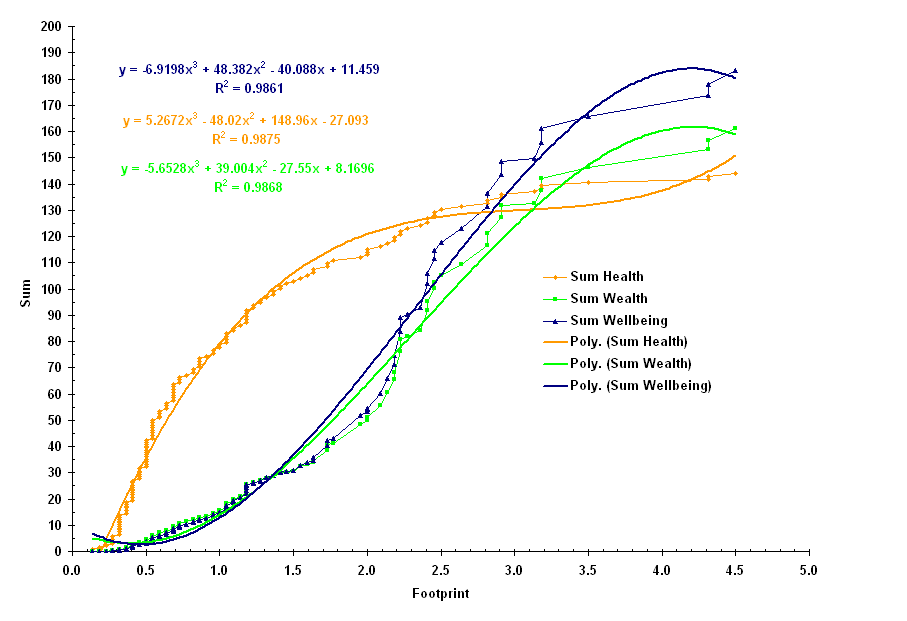
Here, the contributions of the countries are added together for health, wealth, and wellbeing, in order of increasing footprint. Notice that the form of the curves (represented by the polynomial curve fits) is similar to that of the volume of a sphere as a function of its radius, where volume corresponds to the sum, and radius corresponds to the footprint. See Low Footprint Countries for a comparison of countries living within Earth's ecological means. |