|
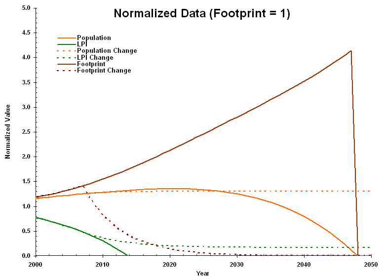
LPR 2006 Projections In October 2006, the WWF released a new version of its Living Planet Report. The report redefined the global ecological footprint and the Living Planet Index (LPI). Projections of the population, LPI, and footprint (based on curve fits to the data in the report) are summarized in the following graph:
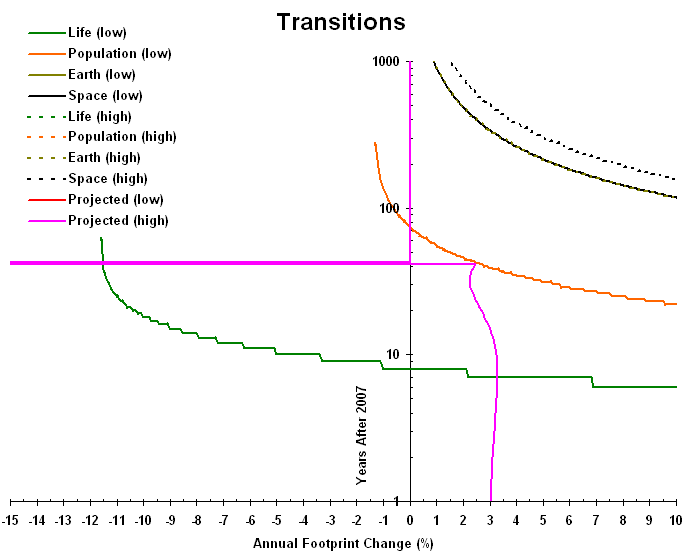
The dotted lines indicate what would happen if the footprint decreased at an annual rate of 16 percent for 30 years and then staying constant: the population would stabilize at its peak; and the LPI, a measure of other species' populations, would level off. The following graph shows when the populations of humans and other species crash, as a function of average annual rate of change of the footprint (representing annual consumption), where the rate changes at the end of 2007 and continues as long as possible:
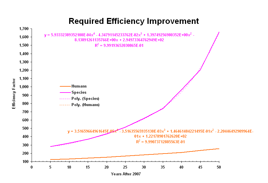
There are two sets of graphs shown here. Solid lines are the best case timing, based on 100 pounds of waste per person per year in 1989 (when the footprint was equal to one planet) and a speed of expansion equal to the speed of light. Dotted lines are the worst case timing, based on 550,000 pounds of waste per person per year and the current space speed record. To avoid species extinction (at the life transition), and catastrophic drop in our population (at the population transition) the footprint must decrease faster than 11.6 percent per year. If we do somehow pass the population transition, we will need to consume the mass of the Earth (after which we reach the "Earth transition"). Following that, we would need to consume mass in space. We will be consuming the mass within an expanding sphere. When the radius of the sphere cannot increase fast enough for the sphere to enclose the mass we must consume, we reach the "space transition." Realistically, we would only reduce annual consumption for a limited period of time and then level off. If we did so, then we would need to increase our efficiency by a factor of more than 100 to avoid losses to our population (after it peaks) and other species' populations crashing. The following graph illustrates how this efficiency factor varies with how long we reduce annual consumption (starting at the end of 2007):
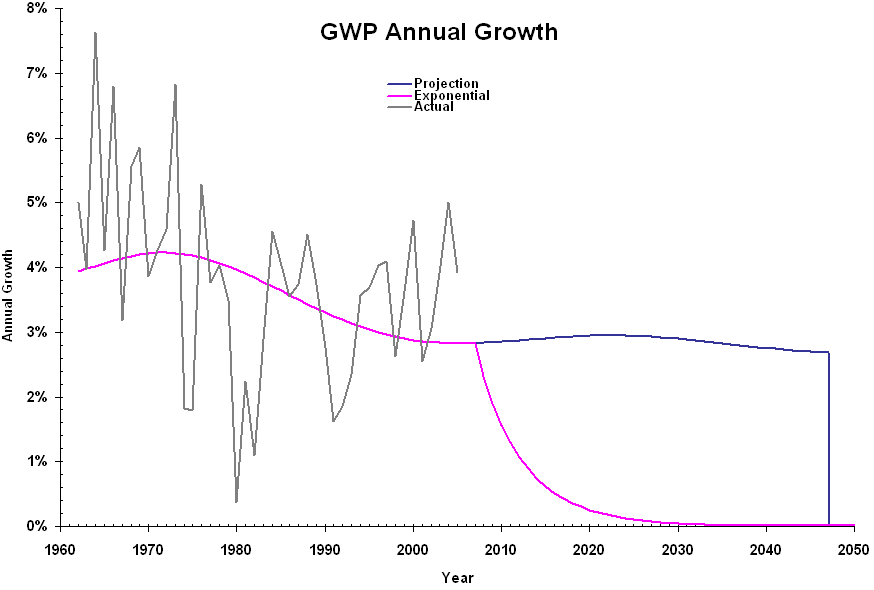
The following graph illustrates the annual increase in Gross World Product, both on its projected trajectory and with an 16 percent annual drop in footprint:
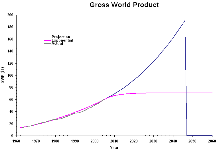
The following graph shows the corresponding values of the GWP (in trillion 2005 dollars):
Under current conditions, the maximum sustainable GWP is about $70 trillion. |