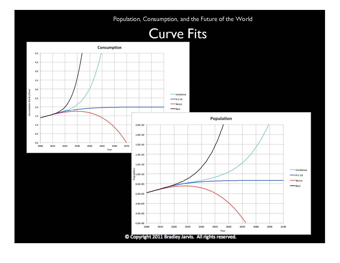
Throughout my research, I've used a mathematical technique called "curve-fitting" to derive algebraic expressions that best describe sets of data. In each of these graphs, I've used three separate curve fits to historical data, representing different outcomes in population, and then come up with a formula that's representative of all three.
The worst of these scenarios is, appropriately, in red. Population and consumption reach a peak by 2030 and then drop to zero. The best scenario, in black, involves massive growth and would almost certainly require us to go into space. Both the worst and best scenarios are based on population and consumption plotted over time, but using different "polynomial curve fits" for the data.
There is, however, an apparent relationship between the population growth rate and consumption. Population growth rate is the percentage change in population from one year to the next. I've done a curve fit to the growth rate as a function of consumption, and it nicely matches what ecologists call a "logistic curve," as shown in dark blue, approaching a value and then staying there. In this case, world population is approaching 8.7 billion people and consumption is approaching 2 Earths.
My father was an industrial engineer. When I was a kid, he introduced me to an estimation method called PERT that was invented by Admiral Hyman Rickover to come up with realistic project schedules in the Navy. I've used it successfully as an engineer and in my research. It is basically an approximation to the familiar statistical bell curve, using three numbers to estimate the mean, or middle, of the curve, which is the expected value of whatever you're measuring. Two of the numbers are extreme guesses, typically the lowest and highest, and the third is the one that most people have guessed (called the "mode"). The expected value is equal to four times the mode, plus the low and the high values, all divided by six.
I've applied the PERT formula to my curve fits, using the worst and best case scenarios as the extremes. The logistic curve is the mode, since it has a common form. The result is the Combined curves, shown in teal. Recently the U.N. released its own projections of population and consumption for 2050, which match very well with the values from my combined curves. This suggests that they may be using similar methods.
© Copyright 2011 Bradley Jarvis. All rights reserved.